Analysing the Question – Checklist
TASK-1 CHECKLIST
Use these checklists to help you analyse and understand Task 1 questions.
Bar Charts & Line Graphs
- What can you learn from the title?
- What information do the 2 axes give?
- What are the units of measurements?
- What is being compared?
- What are the time periods?
- What is the most obvious trend?
- Are there any notable similarities?
(This checklist can also be used for Tables and Pie Charts with the exception of question 2 about axes.)
Process Diagrams
- Is it a linear or a cyclical process?
- Where does the process start and end?
- How many steps are there to the process?
- Can the process be easily broken down into stages?
- What are the raw materials? What is produced at the end of the process?
- What is the end result of the process?
Maps
- What time periods are shown?
- What are the main differences between the maps?
- What features have remained the same over the time period?
BAR CHARTS & LINE GRAPHS
1) What can you learn from the title?
There won’t always be a title but when there is, read it carefully as it will give you important information about the chart or graph and the first clue as to what it’s about. In our example above, the bar chart shows ‘Seal, Whale & Dolphin Populations in the Gormez Straits’.
2) What information do the 2 axes give?
The chart or graph will have a vertical axis and a horizontal axis, often called the ‘x’ and ‘y’ axes.
Each gives a different type of information. In our example, the x axis tells us the years in which the numbers of seals, whales and dolphins were recorded, and the y axis shows how many were recorded.
3) What are the units of measurements?
These could be many different things, for example, amount, time, age, %. The measurements on our example bar chart are the amount in single numbers and time in years. Occasionally, the units won’t be given but you will be able to work out what they are either from the title of the chart or other information it includes.
4) What is being compared?
Usually, IELTS Academic Writing Task 1 questions ask you to compare two or more groups of things. They could include almost anything. In our sample question, we are asked to compare three types of marine mammals. Very often, you will have to compare what happens over a period of time.
5) What are the time periods?
Is the data from the past, the present or the future? Often it will be two or all three of these. This is very important to note because it will determine what tense or tenses you should use. The data in our sample bar chart is all in the past.
6) What is the most obvious trend?
You should look for any clear increases or decreases in the data. They could be gradual or sharp changes.
7) Are there any notable similarities?
Together with noting marked increases and decreases, you also need to look out for things that are similar or stay the same over a period of time.
TABLE
Many students fear tables more than any other type of graphic because they’re just sets of numerical data without any visual representation. However, they are not as complicated as they may at first look.
The key to understanding them is to use the clues given in the title, the row and column headings and the units of measurement. For example, the title of the table below tells us that it shows changes in world population from 1950 to projected levels in 2050. Rows and columns – The world is divided into continents (Africa, Asia, etc.) and data is given for three specific years: 1950, 2000 and projected data for 2050.
In the first table, the units of measurement is billions of people and in the second table, percentages of the total world population are used.

PIE CHART
Pies charts feature regularly in IELTS Academic Writing Task 1. They always show percentages or proportions. Apart from that, they are essentially the same as bar charts and line graphs in that they are another way of presenting data visually.
As with tables, the same checklist of questions can be used to analyse them, with the exception of question 2 about the x and y axes.
Pie charts generally have titles and labels or sometimes a key instead of segment labels as in the sample question below. The key explains what each segment of the pie chart represents.

PROCESS DIAGRAM
Now we move on to a very different type of graphic – the process diagram. Here’s a checklist of questions you can ask to help you analyse and understand them.
1) Is it a linear or a cyclical process?
A linear process starts and finishes at different points. It will often involve the manufacture or creation of something, with raw materials going in at one end and the finished product coming out the other end.
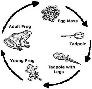
A cyclic process is a process that goes back to the beginning and repeats over and over again, such as the life cycle of a frog.
2) Where does the process start and end?
For a lineal process, this will usually be obvious. It may be harder to determine for a cyclical process so it’s important that you examine the graphic carefully to find out.
3) How many steps are there to the process?
If there are a lot, it can be helpful to number them from 1 to whatever number the final stage is.
4) Can the process be easily broken down into stages?
In the brick-making graphic, for example, there are three stages:
- Creating the bricks from clay
- Manufacturing the finished product by drying and firing
- Packaging and delivery
In the life cycle graphic, there are also three distinct stages where the frog is at different stages of development – egg, juvenile, adult.
5) What are the raw materials? What is produced at the end of the process?
These questions obviously apply only to manufacturing processes. For other types of process, it might be more appropriate to ask the following question.
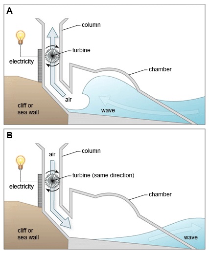
6) What is the end result of the process?
The graphic below shows a different type of process, more of a system, and this question would certainly be helpful to ask here. The end result is the production of electricity.
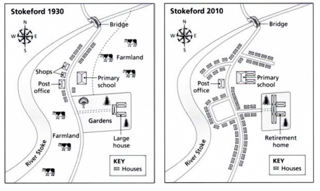
MAPS
For IELTS Academic Writing Task 1 questions about maps, you will normally be asked to compare two or three maps of a place over a period of time. The maps could be from the past or the present. Occasionally you’ll get a map of a proposed development in the future.
Map questions are some of the easiest to answer because the information is very clear, it doesn’t involve numbers and it needs little interpretation. However, we have a short checklist of questions you can ask to help you analyse and understand them.
1) What time periods are shown?
Is the data shown from the past, the present or the future? This is important to note because it will determine whether you should write in the past, present or future tense. The two maps below show the village of Stokeford at two different times in the past.
2) What are the main differences between the maps?
What features have disappeared? What new features are in their place?
3) What features have remained the same over the time period?
Although the location on the maps will have undergone major development, some features will probably remain unchanged.