2 Charts/ 1 Chart and 1 Table

Total hours of sunshine for London, New York and Sydney
| London | 1,180 |
| New York | 2,535 |
| Sydney | 2,473 |
Sample Answer
The data provides information on average temperatures and annual hours of sunshine in London, New York and Sydney.
The temperature patterns of London and New York are similar, although New York has warmer summers and colder winters. In both cities, peaks occur in July/August, at 23° in London and 29° in New York. In contrast, Sydney’s hottest weather is in December/ January when temperatures average 25°. During this period, New York’s temperatures dip to an average of around 5° compared with 8° in London. On the other hand, Sydney’s lowest average temperatures in July are Just over 15°.
As far as hours of sunshine are concerned, New York and Sydney have similar averages of 2,535 and 2,473 hours respectively. London, however, has much lower average of 1,180 hours.
Clearly, London is the coldest city and has the fewest hours of sunshine. New York has the hottest summers, but Sydney enjoys the warmest overall climate.

Sample Answer
The bar chart and table compare five countries in terms of the percentage of families with high-speed internet access, and the change over two consecutive years, from 2001 to 2002.
It is clear that the percentage of families with high-speed internet connection was highest in South Korea and the USA during those years. In addition, the biggest change in the number of families with high-speed internet access occurred in Britain.
In 2001, about 11.2% of South Korean households had access to high-speed internet, compared to 9.3% of US families. One year later, the number of US families with high-speed internet soared by 170% to reach 25.11% of the population, which was the highest figure of all measured countries for those years. By contrast, the growth rate was significantly lower in South Korea, at only 20%.
High-speed internet was not as common in Germany, Switzerland and Britain, with only roughly 0.35% of households having a high-speed connection. All three countries saw significant increases over the year, with Germany and Switzerland witnessing increases of 80% and 120% respectively. Meanwhile, Britain saw the biggest growth rate in high-speed internet connections with a 230% increase.

Sample Answer
The table illustrates the percentage of Australians going to the cinema and their frequency from 1994 to 2002, and the line graph presents how many visits were made according to age group.
It is clear that the percentage of cinema attendants increased, while the average number of visits decreased over the period shown. Additionally, all age groups witnessed fluctuations in their figures, and 14-to 24-year-olds were the most frequent cinema visitors.
In 1994, about 67% of the total population went to cinema with about 10.7 times a year. This attendance increased to 72% two years later and then remained stable until 2002, despite a fall of 2% from 1998 to 2000. Meanwhile, the average frequency peak at 11.3 times annually in 1996, but then it stabilized at around 8.3 times.
Initially, the youngest group went to the cinema 12 times yearly, followed by 10 times of those aged 25 to 34. In contrast, the figure for the oldest group was lowest, at only 8 times per year. In 1996, the figures for all groups rose by about 1 time before decreasing by nearly 5 times in 1998. After that, the quantity of visits of each group grew slightly but the most regular visits still belonged to the youngest group, with about 10 times.


Sample Answer
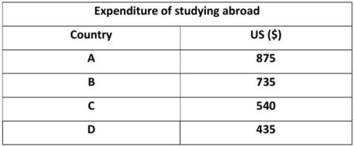
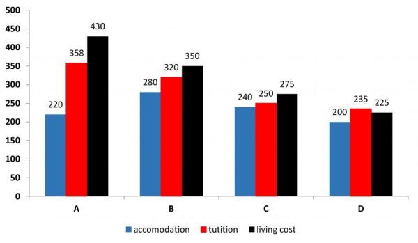
The table and bar chart illustrate the total spending and the average expenditure per week for accommodation, tuition and living costs of students studying abroad in four countries.
Overall, it is clear that the cost of studying in country A is the highest. Also, international students in all countries, except for country D, have to pay the largest amount of money each week for living costs, while they spend the least on accommodation.
Studying abroad in country A costs $875, which is $140 and $335 more than studying in country B and C respectively. International students in country D, however, need to pay a significantly lower amount of money ($435) than those studying in the other three countries.
Overseas students in country A spend an average of $430 per week on living expenses, while those in country B spend only $350. In contrast, the weekly cost of accommodation in country B is $60 higher than that of country A, at $280. The figures for tuition fees in both countries are over $300 a week. Regarding the other two countries, the expenditures for the three categories are all below $300, with the smallest figure being seen in accommodation in country D, at only $200 per week.


Sample Answer
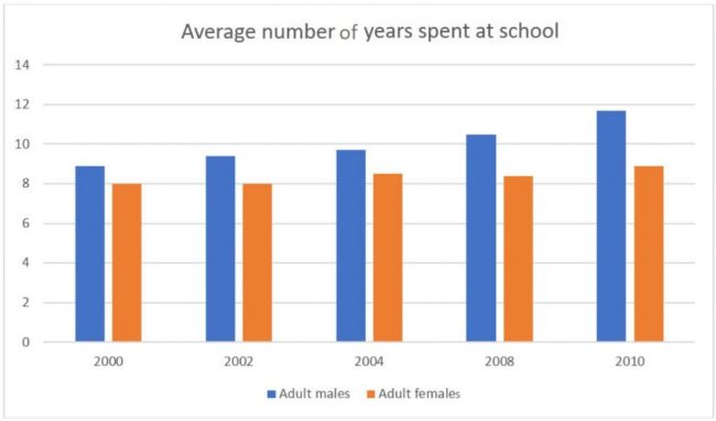
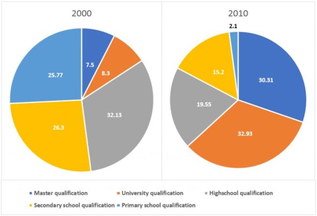
The bar chart illustrates the average number of years males and females attended school, while the pie charts present the different levels of education achieved by adults in Singapore in 2000 and 2010.
Overall, there was an increase in the number of years, for both males and females, that were spent on education. It can also be seen that the figure for males was slightly higher over the period shown. Additionally, the level of education people were attaining had increased over the period.
As can be seen from the bar chart, in 2000, male citizens attended school for an average of 8.9 years, which rose considerably to just under 12 years in 2010. In contrast, the number of years females attended school in 2000 was only 8. This figure remained unchanged until 2008, and then rose to 8.9 years in 2010.
According to the pie charts, in 2000, almost one-third of Singapore’s population finished high school. The figures for those who only finished primary and secondary school were quite high, at approximately 26% each, compared to less than 10% of Singaporeans who had gained a bachelor or master’s degree. However, the level of education people were attaining had increased over the ten year period, with nearly two-thirds of the population obtaining a university degree, and only 2.1% leaving after primary school.
