Bar Charts

Sample Answer
The bar chart illustrates how much waste was collected by a recycling centre over five consecutive years, starting in 2011.
It is clear that the total amount of waste collected each year followed similar trends and only fluctuated slightly. Additionally, while waste paper was the most collected type of recyclable waste, the opposite was true for garden waste during the period.
In 2011, paper was the most collected type of waste, at just under 60 tons, while about 50 tons of glass was collected. Meanwhile, there was approximately 35 tons of discarded tin collected, and 32 tons of plastic waste.
The amount of collected waste paper hit the lowest point of approximately 40 tons in 2013 before rising to over 70 tons in 2015, which was the highest figure for all observed years. Meanwhile, the figures for the other types of waste all witnessed fluctuations throughout the period, with 52 tons of glass, 39 tons of tin and 35 tons of garden waste being collected in the last year.

Sample Answer
The bar chart illustrates the average class size in primary and secondary schools in six different countries, and compares these figures with the world average.
In general, the world average number of pupils in a lower secondary school class was higher than the figure for primary schools. In addition, Asian countries (South Korea and Japan) had a higher number of students on average in classrooms compared with other countries.
In 2006, South Korea, Japan, and the UK all had larger primary school classes when compared with the world average. South Korea had the largest primary school classes, at around 34 students per class. On the other hand, Mexico, Denmark, and Iceland all had smaller than world average primary school classes, at 20, 23, and 21 students per class respectively.
With regards to lower secondary school classes, South Korea, Japan, and Mexico, all had higher than world average class sizes, with South Korea again having the largest classes, at an average of 36 students per class. The UK, Denmark, and Iceland, all had smaller than world average classes, with 18, 21, and 20 students per class respectively.
Sample Answer
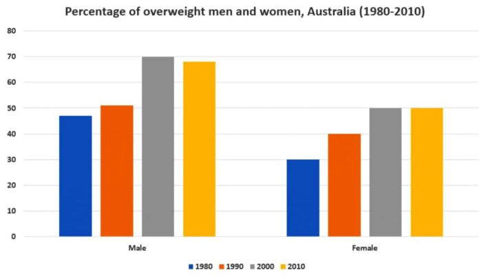
The bar chart illustrates the rate of overweight adults in Australia, at the start of each decade, beginning in 1980.
Overall, it is clear that the percentage of overweight males was significantly higher than females in each year. Additionally, the rate of both men and women who were overweight rose over the research period.
In 1980, just under 50% of Australian men were overweight, compared to only about one-third of females, which were the lowest figures for each gender during the research period.
Over the next 20 years, the rates of overweight male and female citizens in Australia both saw significant increases, with the figure for men reaching a peak of almost 70% in 2000. From 2000 to 2010, slightly fewer men were overweight, as illustrated by a decline of roughly 3% in 2010, whereas the figure for women remained unchanged, with exactly half of Australian women being overweight in the final year.

Sample Answer
The bar chart illustrates the percentages of vehicles sold in four different regions by a car manufacturer, over five consecutive years, starting from 2006.
It is clear that while the proportion of cars sold in Asia increased significantly, the opposite was true in South America. Additionally, the figures for the remaining regions remained relatively stable over the period shown.
In 2006, 30% of cars were sold in Asia and Europe each, just 1% higher than in South America. By contrast, the car sales in North America made up by far the lowest percentage of total sales, at only 11%. Two years later, the proportion of car sales in Asia and Europe both rose moderately, with Europe’s sales peaking at 38% in 2008, whereas there were considerable decreases in the figures for the other regions.
By 2010, the percentage of cars sold in Asia had soared to reach 50%, while those in Europe and South America had declined significantly to 30% and 9% respectively. Meanwhile, the sales in North America, which had dropped to 5% in 2009, had recovered to 11%.
Sample Answer
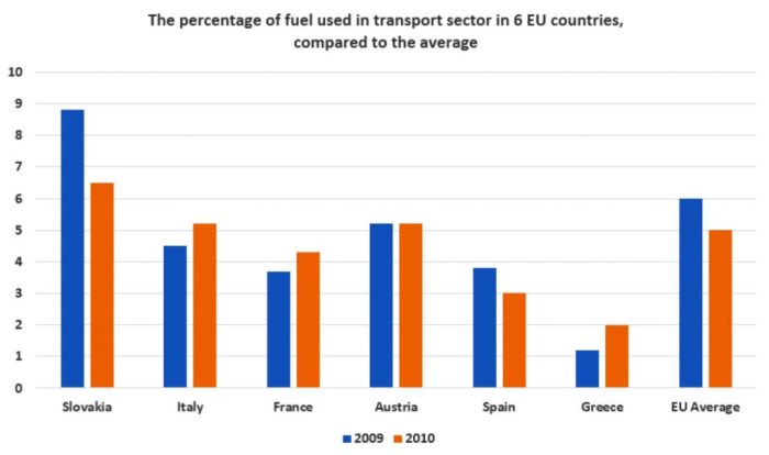
The bar chart illustrates fuel usage for transportation in six different European nations, and compares these figures to the European average, in 2009 and 2010.
Overall, while the percentage of fuel used in Slovakia and Spain decreased, fuel consumption in Italy, France and Greece saw opposite trends during the research period. Additionally, the European average was higher than the figures for all countries, except for Slovakia.
In 2009, the transportation sector in Slovakia consumed nearly 7% of the total fuel, about
2% higher than in Austria. Italy used about 4.5% of fuel in transportation, compared to approximately 1% in Greece, which was the lowest figure shown on the chart. Meanwhile, fuel consumed for transportation in the other countries accounted for just under 4% of total fuel usage in each.
In 2010, the figure for Austria remained unchanged, at just over 5%, and slightly less fuel was used for transportation in Slovakia and Greece as illustrated by decreases to just over 6% and 2% respectively. In contrast, Italy, France, and Greece all experienced increases of roughly 1% in fuel consumption.

Sample Answer
The given bar chart illustrates changes in the number of occupations in tourism-related industries in one UK city from 1989 to 2009.
Overall, it is clear that, except for the year 1994, restaurants registered the highest number of jobs provided in this city while that of travel and tours remained lowest over the research period.
In 1989, the number of jobs in restaurants stood at the highest starting point of about 1100. This figure then saw a steady increase and reached a peak of just over 1600 in 2004 before declining to well under 1400 in 2009. Hotels recorded the second largest number of occupations during the entire period, with the only exception in the year 1994 when it had 1400 jobs and overtook the leading position previously held by restaurants. After that, the number of hotel-related posts dropped gradually to just over 1000 in 2009.
The number of jobs in travel and tours also witnessed the same trend as that of hotels as it reached a peak of roughly 1050 in 1994 before decreasing considerably to about 420. The last sector – sport and leisure – experienced the most unpredictable pattern in the number of jobs provided. In the first five years of the surveyed period, this figure fell to approximately 660. Then, it rose sharply to 1050 in 1999 before dropping back to nearly 700 in 2009.
Sample Answer
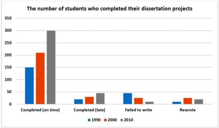
The bar chart compares figures relating to the completion of dissertation projects by students at a university in the UK in 1990, 2000, and 2010.
Overall, it is clear that the majority of students finished their dissertations on time, in all three measured years. It is also worth noting that the number of dissertations completed significantly increased over the period.
In 1990, approximately 150 students submitted their dissertations by the completion deadline, as opposed to around 20 students who completed it late. Meanwhile, just under 50 students failed to write their thesis, while approximately 10 students had to rewrite theirs.
20 years later, the number of dissertations that were completed on time had doubled, to 300, while the number of late submissions had more than doubled, to just under 50. Significantly fewer students failed to write their dissertation, as illustrated by an approximate threefold decline, and the figures for students that rewrote their dissertations rose, to roughly 25 by 2010.
1998

2008
Sample Answer
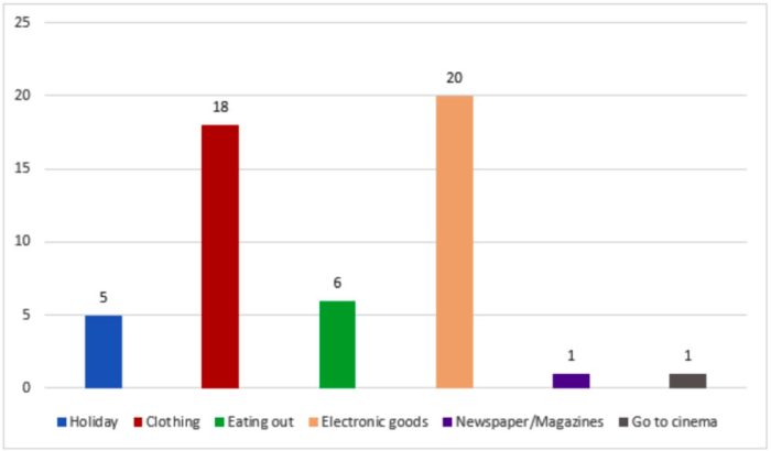
The charts give information about how people in a European country spent their money on different commodities and services in 1998 and 2008.
In general, the proportions of expenditure on electronic goods and clothing were the highest in both surveyed years. Additionally, most of the given categories saw a decrease in their figures, while the expenses for clothing and electronic goods occupied larger proportions of people’s spending.
In 1998, 16% of people’s budget was spent on electronic goods, which was 4% higher than the percentage spent on clothing. Meanwhile, the amount of money spent on holidays and eating out accounted for 8% and 6% respectively. Only 3% of people’s expenditure was used to purchase newspapers and magazines, and an additional 3% for going to the cinema.
The proportion of money spent on clothing rose by 6% in 2008, while that of electronic goods saw a 4% growth. In contrast, the percentage of expenditure used for taking holidays dropped to 5%, while that of eating out remained unchanged. Notably, people reduced their spending on newspapers and magazines, and going to the cinema, down to 1% for each.
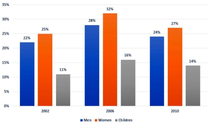
Sample Answer
The chart illustrates the percentage of men, women and children who consumed the recommended amount of fruit and vegetables on a daily basis in three different years.
Overall, women came out first in term of fruit and vegetable consumption while the opposite was true for children.
In all three years, there was a small difference in the percentage of males and females who consumed enough fruit and vegetables every day. The highest figure for women was 32% in 2006 compared to 28% of men. 2010 witnessed the second highest rank for both women and men’s figures. While 27% of women consumed fruit and vegetables, the percentage of men was 24%. And the smallest figure for both women and men, which was nearly the same as the 2010 figures, was recorded in 2002.
The smallest percentage of people consuming the daily recommended amount of fruit and vegetables was children with only 11% in 2002, half as much as that of men and women in the same year. Following that, the figure for children slightly increased to 16% in 2006 before falling marginally to 14% in the last.

Sample Answer
The bar chart illustrates oil generation in six different nations from 1990 and 2010.
It is clear that the amount of oil produced in all countries increased except for Qatar, and that Saudi Arabia saw the biggest change in its capacity. Additionally, while Saudi Arabia was the largest oil manufacturing country over the period shown.
In 1990, Saudi Arabia was a leading oil producer as the amount registered over 8 million barrels, while Iran produced about 3 million barrels. In contrast, there were just under 2 million barrels generated in Kuwait, compared to only nearly 1 million barrels in Qatar. Meanwhile, the figures for Iraq and UAE were relatively similar, at around 2 million barrels each. In 2000, the quantity of oil created in UAE remained unchanged, but the other countries experienced slight increases in their figures.
In 2010, marginally more oil was produced in Iran, Iraq, and UAE as illustrated by rises to around 4 million barrels each, whereas the figure for Kuwatt reached well under that amount. In contrast, there was a dramatically growth in the figure for Saudi Arabia to over 14 million barrels, while Qatar’s figure still stayed extremely low at under 1 million barrels.

Sample Answer
The bar chart illustrates the proportion of global population in four nations in two years 1950 and 2002, and also predictions for 2050.
It is clear that while the percentages of population in India increases, the reverse is true for the other countries over the period shown. Additionally, China and India have highest proportions of population, whereas the figure for Japan is by far lowest during the research period.
In 1950, China was the most populous nation with the figure registering around 23%, while the Indian population accounted for 15% of world population. In contrast, about 7% of people in the world were from the USA, compared to only less than 5% from Japan. In 2002, the rate of the Indian population rose slowly, while China, the US and Japan all saw declines in their figures.
In 2050, India is predicted to have the largest population as illustrated by an increase to nearly 20%. By contrast, the proportions of population in China and Japan are projected to decrease to 15% and about 2% respectively. Meanwhile, the figure for the USA is likely to remain the same, at 5%.
