Pie Charts

Sample Answer
The pie charts illustrates the employment status of people aged 23 to 65, in Ashby and in the UK, in 2008.
Overall, the national unemployment rate was lower than the rate in Ashby. Moreover, while British people generally preferred office work, personal service was the most popular profession in Ashby.
The percentage of jobless people in Ashby was 14%, whereas that recorded in the whole nation was only 10%. The percentage of Ashby residents who were employed in office work and shop work were 18% and 14% respectively, similar to that of the whole of the UK, at 19% and 13% respectively.
In addition, the UK recorded a relatively high proportion of citizens employed in technical work, at 17%, while the figure for the same type of employment in Ashby was only about half that, at 9%. Furthermore, the percentage of construction workers and personal service providers in Ashby, at 16% and 21%, were both higher than the corresponding figures of the UK, at 10% and 17% respectively. Lastly, with regards to professional occupations, 8% of Ashby residents did this type of work, compared to 14% of the whole population.

Sample Answer
The pie charts illustrate electricity consumption by various fields in Eastern Australia in two year 2007 and 2010.
It is clear that the consumption of electricity from those sectors remained unchanged except for Aluminium, Manufacturing and Other metal fields over the period shown. Additionally, the figures for residential and commercial sectors were by far largest.
In 2007, residential areas consumed 28% of total electricity, while 23% of electricity was consumed for commercial purposes. There was 13% of electricity consumed by manufacturing and aluminium sector each, whereas the figures for other metals and mining were slightly lower, at 12% and 9% respectively. By contrast, electricity consumption from transport and agriculture made up only negligible figures.
In 2010, while the percentage of electricity consumed by other metals rose significantly by 6%, those of aluminium and manufacturing fields saw a slight fall to 11% and 9% respectively. Interesting, the proportions of electricity consumed by the other sectors were all as similar as initial figures.

Sample Answer
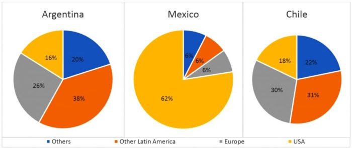
The given pie charts illustrate the percentage breakdown of goods exported from three South American countries, in 2010.
It is clear that while Argentina and Chile’s exports were distributed more evenly amongst other nations, the large majority of Mexico’s exports were to the USA.
From the charts it can be seen that Argentina and Chile’s export trends were almost identical, with the majority of their exports going to other Latin American countries, at 38% for Argentina, and 31% for Chile. Meanwhile, 26% of Argentina’s exports went to Europe, 16% to the USA, and 20% to other countries. Similarly, Chile’s exports consisted of 30% to Europe, 18% to the USA, and 21% to other countries.
In contrast, the large majority of Mexico’s exports were to the USA, at 82%. The remaining exports from Mexico were to Europe, at 6%, other Latin American countries, at 6%, and other countries, also receiving 6%.

Sample Answer
The given pie charts compare the percentage of students using five different means of transportation (Car, Train, Bus, Bicycle, and Walking) to travel to a particular university during 2004 and 2009.
It is noticeable that travelling by train was the least favoured form of transportation, while there was a change, from cars to buses, for the most commonly used form of transport over the five years period.
In 2004, just over half of students travelled to the university by car, with only a third taking a bus. The remaining students rode a bike, went on foot or took a train, with the figures being 9%, 4%, and 3% respectively.
However, with the construction of a new bus stop in 2008 and the introduction of car parking fees in 2006, in 2009 the number of students commuting by car dropped to 28%, and consequently the number of students travelling by all other methods increased. Those travelling by bus increased to 46%, bicycle user’s rose to 16%, and both train travellers and walkers increased by 1% and 2% respectively.

Sample Answer
The given pie charts illustrate information regarding the factors that affected student’s decision to study at a particular British university, between 1987 and 2007.
In general, while having suitable degree courses remained the most important issue when it came to college preference, the distance from their parent’s home became a significant factor over the period shown.
In 1987, the proportion of students choosing a university for having suitable degree courses experienced slight growth from 35% to 37% over the next two decades. The figure for quality of resources, which was the second most common reason in the first year, however, dropped mildly by 4% to 17%. Similarly, students tended to care less about the sport and recreational activities that were provided, with a considerable drop from 19% to 6%, which became the least popular reason for choosing a university in 2007.
Regarding other factors, the number of students who preferred to choose a university that was near to their parents’ houses doubled from 10% to 20% over the period. In contrast, the number of students who were concerned with the quality of professors almost halved, dropping from 15% to 8% during the examined period.


Sample Answer
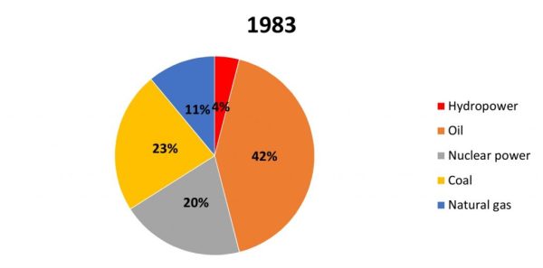
The given pie charts depict data regarding the percentage of energy generated from five different sources (Hydropower, Oil, Nuclear power, Coal, Natural Gas) in a particular country between 1983 and 2003.
In general, it is clear that oil was the most popular source of energy in both years despite a slight decrease. In addition, this country also relied more on using nuclear power and natural gas by 2003.
To begin with, in 1983, oil and coal were used to produce 42% and 23% of the total energy, respectively. Over the next 20 years, the proportion of energy produced from oil saw a slight decline by 4%, while energy from coal also reduced by 10%.
In contrast, there was a reverse pattern in both figures for nuclear power and natural gas, which increased by 4% and 10% respectively to collectively surpass the percentage of energy generated from coal. On the other hand, hydropower was responsible for only 4% of energy produced in both years.

Sample Answer
The pie charts detail the proportion of people’s total expenditure on six different goods and services (housing, clothing, entertainment, food, travel/transport, and luxury goods), in a European country, in 1958 and 2008.
It is clear from the charts that spending in all aspects, except clothing, changed quite substantially over the fifty year period.
In 1958, people spent the largest portion of their spending on food, at 32%. The two other categories that took up the majority of people’s money were housing, at 22%, and clothing at 18%. Entertainment, travel/transport and luxury goods only comprised around a quarter of all spending at 13%, 8% and & 7% respectively.
50 years later spending changed quite significantly with housing now becoming the biggest expense and taking up almost one third of total spending, at 32%. The expenditure on clothing, transport/travel and luxury goods all increased and all took up around 16-17% of the total spending. The expenditure on food dropped significantly to 12%, while entertainment costs were only half of that.
