One Table

Sample Answer
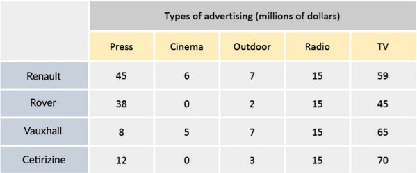
The table shows the amount of money that four car manufacturing companies spent on different forms of advertising in the UK, in 2002.
It is clear that Renault spent the largest amount of money on advertising during 2002. In addition, TV advertisements were by far the most popular advertising format, while the opposite was true for cinema advertising.
In 2002, Cetirizine allocated $70 million for TV advertisements, while the figure for Vauxhall was slightly lower, at $65 million. Meanwhile, $59 million was spent on TV commercials by Renault, and only $45 million by Rover. In terms of press advertising, the amount of money spent by Renault was again largest, at $45 million, slightly higher than that of Rover, at $38 million. In contrast, Vauxhall and Cetirizine only spent $8 million and $12 million on press advertising, respectively.
Of the other forms, advertising in cinemas and outdoors incurred the lowest costs, with less than $10 million spent by each company. It is also notable that expenditure on radio advertising by all car manufacturers was similar, at $15 million each.
Salary in Dollars

Sample Answer
The table compares secondary and high school teachers’ salaries in five countries in 2009.
Overall, while teachers in Luxembourg were the most well-paid, teachers from Australia were the lowest-paid. In addition, the amount of time it took for a teacher in Denmark to earn the maximum salary was much faster than most other countries.
Secondary and high school teachers in Luxembourg were paid a starting salary of $80,000 a year, while the figure for teachers in Denmark was significantly lower, at $45,000. Additionally, the starting salary for an inexperienced teacher in other countries stood at around $30,000.
However, teachers with at least 15 years of experience in Luxembourg earned up to $119,000 a year, while teachers in Denmark and Japan with the same level of experience only made salaries of $54,000 and $65,000 respectively. Meanwhile, Australian and Korean teachers with at least 15 years’ experience were paid the lowest salaries, at $48,000 a year. Also worth noting is that it only took teachers in Australia and Denmark less than 10 years to receive their maximum salary, while teachers in the other countries had to wait for at least 30 years.

Sample Answer
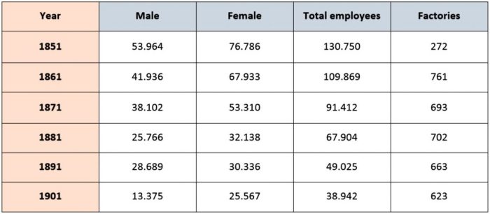
The table provides information about the workforce in silk production, in two countries, England and Wales, over a period of 50 years, starting from 1851.
It is clear that the total number of silk workers in the two countries declined over the period, and that significantly more women were employed than men in this industry. Also, the number of silk manufacturing factories increased over the 50 year period, despite some fluctuations.
In 1851, the silk workforce was at its peak, with 130,750 employees, including 76,786 females and approximately 54,000 males. In contrast, the number of silk factories was at its lowest in 1851, at only 272. However, ten years later, the number of silk factories had almost tripled, reaching 761, while the total number of employees experienced a significant fall of over 20,000 people.
Over the following 40 years, the total number of female and male workers gradually decreased throughout the period, to 25,567 and 13,375 respectively, which resulted in a drop in the total number of employees, at 38,942 in 1901. Meanwhile, the number of silk factories experienced a gradual decline over these 40 years, from 761 in 1861 to 623 in 1901.

Sample Answer
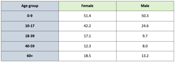
The table compares the proportions of people who rode a bike, by age and gender, in 2011.
In general, children under nine years old used bicycles the most, while middle-aged people were the least likely to ride a bicycle. Also, men tended to cycle more than women during the period shown.
Among males, children under 9 years old made up the largest proportion of cyclists, at 52%. However, with the older groups, the rates were only 42% for teenagers aged from 10 to 17, and 17% for people aged between 18 and 39. The proportion of 40 to 50 year old male cyclists was the lowest, at just 12%, while only nearly a fifth of men aged over enjoyed this activity.
The percentage of girls younger than 9 years old who cycled was slightly higher than boys of the same age, at 52%. However, the figure for girls aged 10 to 17 was just under a quarter, much lower than that of their counterparts. Similar to men in the same age groups, cycling was not very popular amongst women aged 40 to 59, and 60 or over, accounting for only 8% and 14% of females respectively.

Sample Answer
The table illustrates the percentages of males and females at different physical fitness levels in a particular nation between 1999 and 2009.
Obviously, most women and men were at normal weight during the research period. While the percentage of overweight women increased, the reverse was true for men.
In 1999, 49% of women had a normal weight, while the figure for those who were underweight stood at about half of that percent. A similar pattern was seen in males but the figures were smaller, at 41% and 22% respectively. Overweight females made up 18% in that year, much lower than that of female counterparts, with 30%.
The percentages of underweight women and men both rose in 2004, to 51% and 48% respectively, before falling to 47% each in 2009. Similarly, overweight females and males accounted for smaller percentages of the population in 2004, at 21% and 23%, and both figures then went down to 19% each in 2009. Despite a rise of 2% in the first five years, the percentage of women with an underweight then decreased by 1%. However, the opposite trends were witnessed in underweight men’s percentage, with 20% and 23% respectively.

Sample Answer
The diagram illustrates the daily production of oil in four countries during the period between 2000 and 2004.
Overall, Congo was the leading producer of oil per day during the five-year period, while Chad produced the least amount of oil per day over the same period. Meanwhile, the amount of oil generated per day each year in Congo decreased over time, while the opposite was true for that of other countries.
Starting with 205,000 barrels per day in 2000, Nigeria’s daily oil production slightly fluctuated around 200,000 to end up at 213,000 barrels per day in 2004. In contrast, Congo’s oil production figures were the highest in the first year of the period at 275,000 barrels per day, however, gradually decreased over the years to reach 203,000 barrels per day in 2004.
It can also be seen that Somalia produced 5,000 barrels of oil each day in 2000, but later boosted its daily production capability considerably to 10 times more barrels per day in 2004. Finally, oil production in Chad did not begin until 2003, generating 8,000 barrels per day, sharply increasing to 50,000 barrels per day in 2004.

Sample Answer
The table gives information about the percentages of males and females at the age of 15 and 75 in the UK during the years 1911, 1961 and 2011.
Overall, there was a decrease in the proportion of people aged 15, whereas the figures for those aged 75 increased throughout the period. In addition, there were significantly more elderly women than men.
Regarding those aged 15, the number of females experienced an overall downward trend, beginning with 335,730 in 1911 and finishing with 333,700 in 2011. The opposite was seen for males, as the number of 15 year-olds increased from 334,241 in 1911 to 354,400 in 2011.
For those aged 75, the female population was significantly larger than the male, and there was a similar trend between the two genders. Starting at 47,351 females and 34,012 males in 1911, the figures for females surged to a peak of roughly 255,000 and 160,000 for males in 1961. Following this, the number of females aged 75 decreased to 210,100 people, while that of their male counterparts continued to rise to 181,300 in 2011.
